HR leaders face a constant challenge: understanding workforce health without drowning in scattered data across multiple systems. Comprehensive health dashboards solve this by bringing everything into one clear view.
At The Pledge, we’ve seen firsthand how organizations that track health metrics in real time catch problems early, reduce absences, and boost productivity. This guide shows you how to implement dashboards that actually work for your teams.
Why Health Dashboards Matter Now More Than Ever
Healthcare costs keep climbing, and employee absences hit record levels. According to HR Acuity’s Ninth Annual Employee Relations Benchmark Study, organizations struggle to connect scattered health data with workforce performance. When health information lives in separate systems-insurance claims here, attendance records there, wellness program data somewhere else-HR leaders cannot see what actually happens. Real-time dashboards change that equation entirely.
Aggregating Data Into One Source of Truth
Dashboards aggregate data from your HRIS, health plans, wellness platforms, and attendance systems into a single source of truth. This matters because absenteeism costs U.S. employers roughly 2.7% of payroll annually, and much of it traces back to unmanaged health issues that dashboards catch early. When HR leaders see presenteeism trends, burnout signals, and health risk indicators in real time, they stop reacting to crises and start preventing them. A centralized view transforms how your team responds to workforce health challenges.
The Direct Link Between Visibility and Cost Control
Organizations that monitor health metrics continuously report measurably lower healthcare spend. Marsh McLennan’s digital health tools improved outcomes for employees through targeted interventions before problems escalated. When you track absenteeism, health risk indicators, and engagement in one place, you identify which teams need wellness support, which managers have high ER caseloads tied to burnout, and where safety gaps exist.
A health dashboard reveals patterns that spreadsheets hide. Spikes in absences correlate with specific departments or managers. High presenteeism flags emerge in teams with unresolved complaints or overwork. These insights let you allocate wellness resources where they’ll have the biggest impact, not across the board.
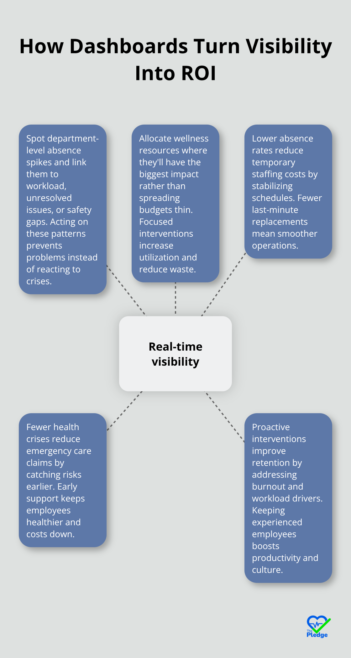
The ROI compounds quickly: lower absence rates reduce temporary staffing costs, fewer health crises reduce emergency care claims, and proactive interventions improve retention.
Actionable Data Drives Confident Decisions
Generic reports arrive too late. A health dashboard with intelligent alerts flags at-risk populations in real time so your team acts before small problems become expensive ones. Track vaccination coverage, burnout signals measured through engagement surveys, health risk scores from your wellness platform, and ergonomic incident trends all in one view. When data arrives with context-benchmarked against industry standards from SHRM or your peer group-leaders make confident decisions fast.
The strongest dashboards link health metrics to business outcomes. If you can show that reducing absenteeism in Department X correlates with a 12% productivity lift, suddenly wellness investments become strategic, not just nice-to-have. That connection transforms how executives fund and prioritize health programs. With this foundation in place, the next step involves understanding which specific features separate effective dashboards from those that collect dust.
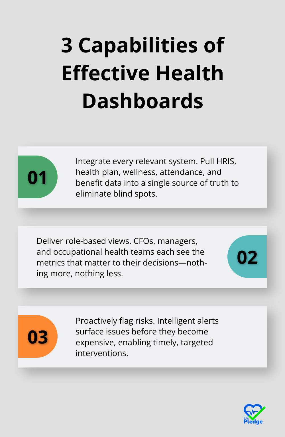
What Makes a Health Dashboard Actually Useful
Effective health dashboards separate themselves from generic reporting tools through three specific capabilities: they pull data from every system your organization uses, they let different teams see what matters most to them, and they flag problems before they become expensive. Most organizations fail at implementation because they build dashboards that look impressive but don’t answer the questions their teams actually need answered.
Integrating Data Without Creating New Silos
Your HRIS tracks attendance and demographics. Your health plan captures claims and costs. Your wellness platform records program participation. Your benefits administration system holds enrollment data. These systems rarely talk to each other, which means your health dashboard is only as strong as your worst data connection. Start by mapping exactly where each metric lives: absenteeism from your HRIS, health risk scores from your wellness vendor, vaccination records from your occupational health system, and engagement survey responses from your pulse survey tool. Then pick a single source of truth-either a dedicated analytics platform or your HRIS if it supports robust data integration across HRIS and health plan systems-and route everything through it. Modern HRIS platforms now offer pre-built connectors to major health and wellness vendors, which cuts implementation time from months to weeks. The critical step is standardizing definitions across systems before you integrate them. If one system counts a sick day as any unscheduled absence while another counts only medical-certified absences, your dashboard will show conflicting numbers that destroy credibility with leadership.
Building Metrics That Match How Your Teams Actually Work
A health dashboard designed for your CFO should look completely different from one designed for department managers or your occupational health team. Your CFO needs to see healthcare spend trends, absence cost impact, and ROI on wellness investments tied to employee retention. Your operations manager needs to know which shifts or teams have the highest absenteeism this week so she can adjust staffing. Your occupational health specialist needs ergonomic incident patterns, vaccination coverage gaps, and health risk distributions across the workforce. Instead of building one massive dashboard with every possible metric, create role-based dashboard views for different stakeholder needs that show each stakeholder exactly what they need to act on. Include benchmarks from SHRM or your peer group on every metric so leaders understand whether a 6% turnover rate is good or concerning relative to your industry. Without context, numbers are meaningless.
Alerts That Catch Problems Before They Cascade
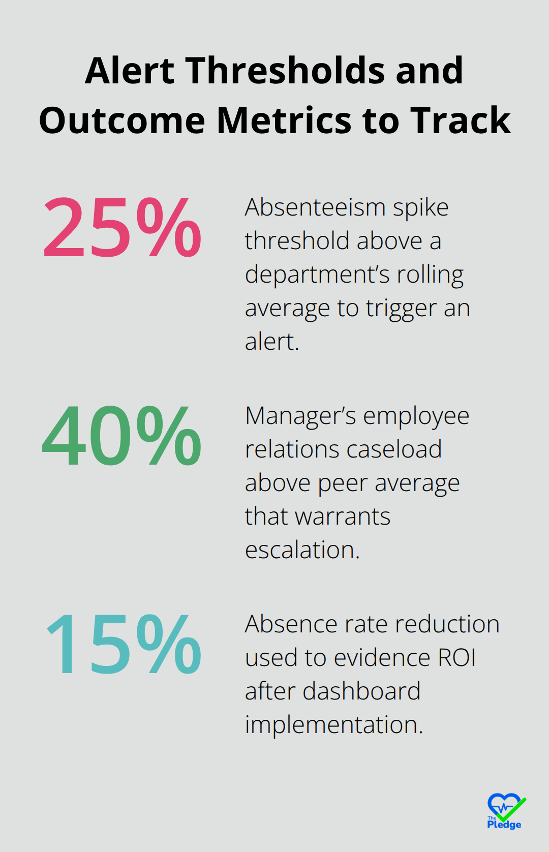
The difference between a dashboard and a reactive reporting tool is intelligent alerting. Set thresholds that trigger notifications when specific conditions appear: when absenteeism in a department spikes 25% above its rolling average, when a manager’s employee relations caseload exceeds his peer average by 40%, when health risk scores for a team indicate elevated burnout signals, or when vaccination coverage drops below your organizational target.
These alerts should land in the right person’s inbox with context, not just a number. An alert to an operations manager should say something like: Department Z absenteeism jumped from 3.2% to 4.8% in the past two weeks. This correlates with three unresolved employee relations cases in that department. Recommend wellness outreach and case follow-up. That level of specificity drives action. Without it, alerts become noise that people ignore. Also build in safeguards against alert fatigue-too many notifications train people to dismiss them. Prioritize the alerts that actually indicate problems worth investigating rather than flagging every minor fluctuation.
The technical foundation matters, but the real power emerges when your organization connects these dashboards to actual decisions. How your leadership team interprets and acts on dashboard insights determines whether you’ve built a strategic asset or an expensive reporting system.
Making Health Dashboards Work in Your Organization
Implementation fails most often not because the technology is wrong, but because organizations underestimate the work required to connect systems, train people, and align decisions around data. Companies spend six months building beautiful dashboards only to watch them gather dust because no one knew how to use them or trust the numbers inside. The gap between launching a dashboard and actually changing how your organization operates is where most initiatives collapse.
Audit Your Data Sources and Standardize Definitions
Your first step is unglamorous but critical: audit every system that holds health or workforce data and document exactly what lives where. Your HRIS contains attendance records and demographics. Your health plan vendor stores claims and costs. Your wellness platform tracks program participation and health risk assessments. Your benefits administration system houses enrollment and coverage details. Your occupational health provider manages vaccination records and incident reports. Most organizations discover these systems cannot communicate with each other, which means someone has to manually extract data from each one, reconcile conflicting definitions, and feed it into your dashboard platform. This manual work introduces errors, delays, and version conflicts that destroy credibility the moment leadership spots a discrepancy.
Instead, identify which system will serve as your single source of truth and prioritize direct integrations through APIs or pre-built connectors. Modern HRIS platforms now offer connectors to major health and wellness vendors, which compresses implementation from months to weeks. If your systems lack native connectors, invest in middleware that standardizes data definitions before anything reaches your dashboard. Define absenteeism the same way across every system before integration starts. One system counting any unscheduled absence while another counts only medical-certified absences will generate conflicting numbers that leaders will rightfully distrust. The technical integration matters less than the data standardization work that precedes it.
Train Teams by Role and Establish Decision Protocols
Training determines whether your dashboard becomes a strategic asset or expensive decoration. Most organizations conduct a single training session where they show people the interface and assume adoption happens naturally. Instead, segment your training by role and use frequency. Your CFO needs a 30-minute quarterly deep dive showing healthcare spend trends and ROI measurement tied to retention. Your operations managers need a 15-minute weekly check-in focused on staffing implications of absence patterns in their departments. Your occupational health team needs daily access with technical training on filtering, exporting, and interpreting health risk distributions. Your employee relations specialists need specific training on correlating ER caseloads with engagement scores and health risk indicators to identify systemic issues before they escalate.
Conduct live sessions where people actually navigate the dashboard while you talk through decisions they might make based on what they see. Then schedule follow-up sessions two weeks later because people forget what they learned in passive training. Assign a dashboard champion in each department who becomes the expert other team members turn to with questions. This person should attend advanced training and serve as your internal advocate. Without this distributed knowledge, adoption stalls because people revert to whatever method they used before the dashboard existed.
Establish clear decision protocols that reference the dashboard explicitly. If your wellness committee meets monthly, require that every agenda item references relevant dashboard data. If your leadership team reviews retention quarterly, mandate that discussion starts with absence and engagement trends from the dashboard. When decisions explicitly reference dashboard data, people understand that using the dashboard is not optional or nice-to-have but fundamental to how your organization operates.
Use Benchmarks to Transform Numbers Into Strategy
Benchmarking transforms raw numbers into strategic information. A 5.2% absence rate means nothing without context. Is that good or bad compared to your industry? Compared to your peer group? Compared to your own performance last year? Making health data actionable through benchmarking provides external reference points across industry groupings, sectors, organization sizes, and regions. Many health analytics vendors provide peer benchmarking where your metrics are compared against similar organizations within their customer base. Use both. If your absence rate sits at 5.2% and benchmarking data shows your industry average is 4.1%, suddenly you know you have a problem worth investigating. If peer benchmarking shows organizations similar to yours average 4.8%, you know whether your problem is industry-wide or specific to your organization.
Include these benchmarks directly in your dashboard so leaders see context automatically rather than requesting it separately. This approach (combining internal metrics with external reference points) transforms abstract numbers into actionable intelligence that drives decisions.
Connect Health Metrics to Business Outcomes and Measure ROI
Measuring ROI requires connecting health metrics to business outcomes. Track healthcare spend before and after implementing your dashboard to quantify savings from earlier intervention. Correlate absence rate improvements with productivity metrics your finance team tracks. If absence dropped 15% and revenue per full-time employee increased 8% during the same period, you have a compelling business case for continued investment.
Document specific interventions that dashboards enabled: a manager identified through ER case analysis who received coaching on communication and saw his team’s engagement score improve 12 points, or an ergonomic incident spike that triggered a workstation assessment program that reduced incidents 40% in the following quarter. These concrete examples (rather than abstract claims about data value) resonate with leadership far more effectively. Set baseline metrics before you launch your dashboard so you can measure impact honestly. Without a baseline, you cannot prove the dashboard drove any improvement.
Final Thoughts
Health dashboards work because they transform scattered data into decisions that stick. Organizations that implement comprehensive health dashboards stop reacting to absence spikes and start preventing them, catch burnout signals before employees leave, and allocate wellness resources where they’ll actually reduce costs rather than spreading budgets thin across programs nobody uses. The pattern is consistent: real-time visibility into workforce health drives measurable improvements in retention, productivity, and healthcare spend.
Starting your dashboard journey requires picking one clear problem to solve first rather than tracking everything at once. Maybe your organization has unacceptable absence rates in specific departments, or your healthcare costs keep climbing despite wellness program investments, or your employee relations team spends all their time fighting fires instead of preventing problems. Pick that one problem, build a dashboard that addresses it, measure the impact, then expand from there-this focused approach builds credibility with leadership and creates momentum for broader adoption.
The technology itself matters less than the commitment to using data in your decision-making process. Comprehensive health dashboards only create value when your organization actually changes how it operates based on what the data shows, which means establishing decision protocols where dashboard insights inform every conversation about workforce health and training people by role so they understand what the numbers mean for their specific responsibilities. The Pledge centralizes health data and provides real-time updates that align perfectly with this dashboard approach, removing the fragmentation that makes health dashboards difficult to build in the first place.